
Vaizdas:Global Warming Predictions Map.jpg
Global_Warming_Predictions_Map.jpg (559 × 408 taškų, rinkmenos dydis: 90 KiB, MIME tipas: image/jpeg)
| Ši byla yra iš bendros Wikimedia Commons nemokamų resursų duomenų bazės, palaikomos Wikimedia Foundation organizacijos. Norėdami sužinoti licencijavimo smulkmenas, žiūrėkite paveikslėlio aprašymą |  |
Į paveikslėlio aprašymą |


Aprašymas

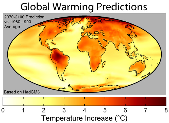
This figure shows the predicted distribution of temperature change due to global warming from Hadley Centre HadCM3 climate model[1]. These changes are based on the IS92a ("business as usual") projections of carbon dioxide and other greenhouse gas emissions during the next century, and essentially assume normal levels of economic growth and no significant steps are taken to combat global greenhouse gas emissions.
The plotted colors show predicted surface temperature changes expressed as the average prediction for 2070-2100 relative to the model's baseline temperatures in 1960-1990. The average change is 3.0°C, placing this model towards the low end of the Intergovernmental Panel on Climate Change's 1.4-5.8°C predicted climate change from 1990 to 2100[2]. As can be expected from their lower specific heat, continents warm more rapidly than the oceans in the model with an average of 4.2°C to 2.5°C respectively. The lowest predicted warming is 0.55°C south of South America, and the highest is 9.2°C in the Arctic Ocean (points exceeding 8°C are plotted as black).
This model is fairly homogeneuous except for strong warming around the Arctic Ocean related to melting sea ice and strong warming in South America related to predicted changes in the El Niño cycle and the possible collapse of the Amazon Rainforest. This pattern is not a universal feature of models, as other models can produce large variations in other regions (e.g. Africa and India) and less extreme changes in places like South America.
References
Copyright
This figure was prepared by Robert A. Rohde from publicly available data, and is incorporated into the Global Warming Art project.

|
Suteikiamas leidimas kopijuoti, platinti ir/ar redaguoti šį dokumentą pagal GNU Free Documentation licencijos versijos 1.2 ar bet kurios vėlesnės versijos sąlygas, publikuotas Free Software Foundation; be nekintamų dalių, be priekinių ir galinių tekstinių žymų viršeliuose. Šios licencijos kopija įtraukta dalyje, pavadintoje GNU Free Documentation License. |
| Šiam failui taikoma Creative Commons Attribution-Share Alike 3.0 Unported licencija. | ||
| ||
| Licencijos šablonas buvo priskirtas šiam failui kaip GFDL licencijos atnaujinimo dalis. |
Rinkmenos istorija
Paspauskite ant datos/laiko, kad pamatytumėte rinkmeną tokią, kokia ji buvo tuo metu.
| Data/Laikas | Miniatiūra | Matmenys | Naudotojas | Paaiškinimas | |
|---|---|---|---|---|---|
| dabartinis | 17:43, 10 lapkričio 2007 | | 559 × 408 (90 KiB) | Toony | {{Information |Description=Global_Warming_Predictions_Map |Source=gwart |Date= |Author=GWart |Permission= |other_versions= }} |
| 17:40, 10 lapkričio 2007 |  | 559 × 408 (90 KiB) | Toony | {{Information |Description=Global_Warming_Predictions_Map. |Source=GWART |Date= |Author=GWART |Permission= |other_versions= }} | |
| 17:36, 10 lapkričio 2007 |  | 559 × 408 (45 KiB) | Toony | {{Information |Description=Global_Warming_Predictions_Map_fr |Source=GWART[http://www.globalwarmingart.com/wiki/Image:Global_Warming_Predictions_Map_jpg] |Date=nov 2007 |Author=GWART |Permission= |other_versions= }} | |
| 11:20, 24 rugsėjo 2006 |  | 559 × 408 (90 KiB) | Nils Simon | ||
| 09:55, 10 balandžio 2006 |  | 559 × 408 (90 KiB) | Pflatau | == Summary == thumb|right|250px|A comparison of predictions of global warming from 8 different climate models assuming the [[SRES A2 emissions scenario.]] This figure shows the predicted distribution of [[temperat |
Paveikslėlio naudojimas
Paveikslėlis yra naudojamas šiuose puslapiuose:
Visuotinis rinkmenos naudojimas
Ši rinkmena naudojama šiose viki svetainėse:
- Naudojama azb.wikipedia.org
- Naudojama az.wiktionary.org
- Naudojama bg.wikipedia.org
- Naudojama de.wikipedia.org
- Naudojama el.wikipedia.org
- Naudojama en.wikipedia.org
- 2000s
- User:Dragons flight/Images
- Wikipedia:Today's featured article/June 2006
- Wikipedia:Today's featured article/June 21, 2006
- User:UBeR/GWcleanup
- User:Camacan
- User:Camacan/userboxes/User Global Warming
- Wikipedia:Reference desk/Archives/Science/2009 February 21
- Key events of the 20th century
- User:Mytwocents/Globalnull Warmingnull
- Wikipedia:Village pump (technical)/Archive K
- User:Phoenix B 1of3/UBX Global Warming
- User:Aymdaman777
- Migration of marine species in the Northern Atlantic Ocean
- Post-Western era
- Naudojama en.wikinews.org
- Kyoto Protocol comes into effect
- Wikinews:Template messages/Infoboxes
- British scientists claim 2005 warmest yet in Northern Hemisphere
- Australian Labor Party announces new Climate Change Policy
- Australian government says technology could reduce emissions three times more than Kyoto
- US senators on Greenland tour
- People rally worldwide for action against climate change
- World climate conference in Nairobi
- IEA warns: bleak future for the World without more energy investment
- Template:Climate change
- Scientist: Sulfur remedy for greenhouse effect backed by data
- Warming oceans make it harder for fish to breathe
- New Zealand Green party rates other parties on climate change policies
- Study: Arctic ice could be gone by 2020
- Climate campaigners scale UK Parliament and hang protest banners from the building
- EU, US declare intent to cooperate on climate change at summit
- G8 leaders set new emissions target
- Hopes for treaty on climate begin to wither
- Erosion influences Nigerian climate policy
- Scientists: Snow on Mt. Kilimanjaro to melt in twenty years
- Public access to information on emissions from European industries
- IPCC claims about Himalayan glaciers were not based on science
- Healing ozone layer may contribute to global warming
- IPCC chief refuses to apologize for glacier error
- Template:Infobox/lookup/Climate change
- Glasgow Climate Pact deal struck; nations to reduce coal usage
- Study: floods, droughts more intense in past 20 years due to higher global temperatures
- Heatwaves surge worldwide as researchers' analysis indicates global temperatures reaching new highs
- Naudojama en.wikiversity.org
Žiūrėti visuotinį šios rinkmenos naudojimą.